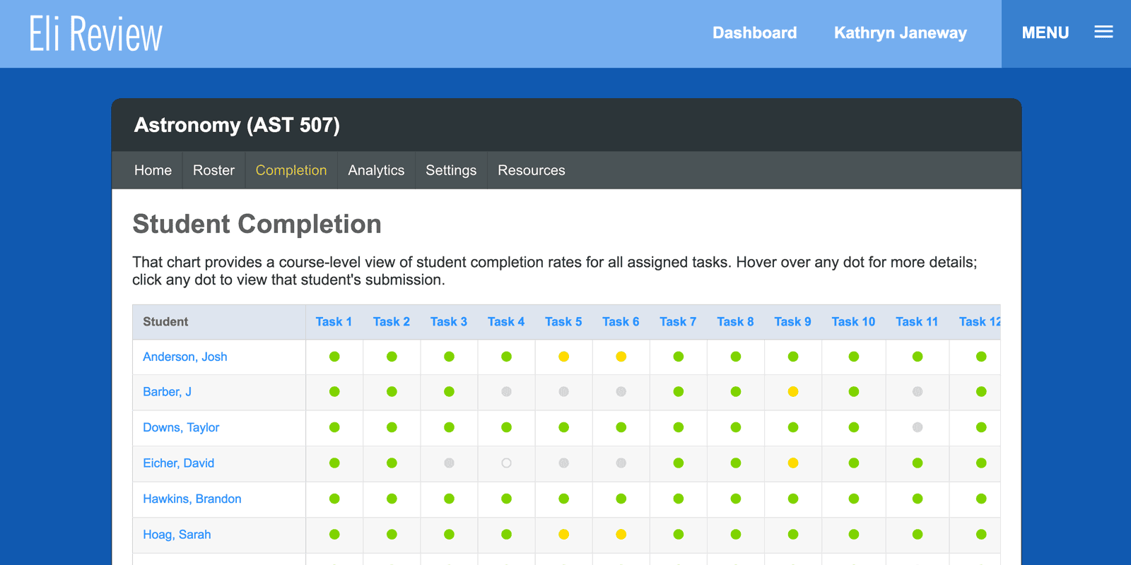
We’re releasing a new feature today that lets instructors see all students’ participation across all tasks at a glance. Starting today, all courses (active and legacy courses) have a new class-level “Completion Report.” Instructors can find it in the course navigation menu, between Roster and Analytics.

The report is a table that combines a roster view with a dashboard view. Each assigned task has a column; each student has a row. Each cell indicates a student’s progress using colored dots like those in the current task reports:
- Green dots: student completed the task on time
- Yellow dot: student completed the task late
- Grey dot: student has not completed the task
- Empty circle: student was not assigned the review task
Hovering over any dot gives a detailed description of that submission, and clicking a dot (green, yellow, or grey) will load that student’s submission details for that task.
If you are giving students lots of practice opportunities, these tables can get pretty big. Eli conserves space by allowing big tables to scroll horizontally once they’ve gotten too big for one screen.
We’ve got big plans for this feature: a CSV download in the short-term; gradebook sync for LMS integration in the long-term.
Updates and Improvement
We’re also releasing some small improvements to student and instructor revision plans. These are based on feedback from instructors, particular faculty from the University of Vermont and San Francisco State University, who’ve pointed out where students have struggled to understand how to build their plans. The biggest of these updates are for students, particularly new visuals cues and streamlined saving of notes:
- The difference between optional and assigned revision plans is now more clear for students
- Improved contrast for students between instructor requirements and system microcopy
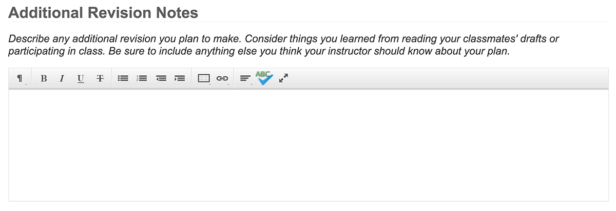
- Revision plan notes are now open by default – students don’t need to click a button to start writing one
- Student revision plan notes (on individual comments or global plan notes) will now save even if the student forgets to click the “save” button
- For instructors, dashboard language more precisely indicates if a revision task has a plan or not (replacing confusing language when only revise & resubmit tasks assigned)
As always, thanks to our community of instructors for the thoughtful, helpful feedback that helps us improve the app for everyone.


